


Thirty-One Circles
Platform Design
The Thirty-One Circles platform helps marketing individuals create, understand and optimise their audiences.
A new platform that brings together exporting, importing, analysing, optimising and managing marketing data, Thirty-One circles has the ability to utilise first-party marketing data, allowing its users to segment their audiences effectively with the aim to cut down on wasted marketing cost.
I joined this project to work on the visual and experience design of the platform, to help solve some of the usability issues reported from the first version of the build.
I worked directly with a testing group of marketing professionals with an agency background, as well as feedback from an in-house marketing client to form an iterative design process spanning from IA to full UI designs.
The Design Problem
The platform is used by users that have a varying levels of industry experience. While the technology behind it serves as a powerful tool, its many features can be confusing to navigate especially when there is a lack of hierarchy in the architecture.
User Groups and Goals
To understand the potential user journeys, I looked the user goals and the tasks users have to perform to achieve them. I separated the tasks into three categories. Here we see the “general” tasks and “project specifc” tasks seperated. The super users in this instance will most likely be marketing managers / team leads who have admin access.
Addressing the Hierarchal Issue Within the Architecture of the Platform
Users pointed out it was confusing to be landed within a specific project and to have to go backwards to switch to a different one. I went back to the user goals and mapped out linear steps to form a user journey for each function.
Linear flows allowed for us to determine there a missing page, as well as a reordering in the architecture that as the root of the problem. Using these flows, a revised IA was formed to tackle these issues.
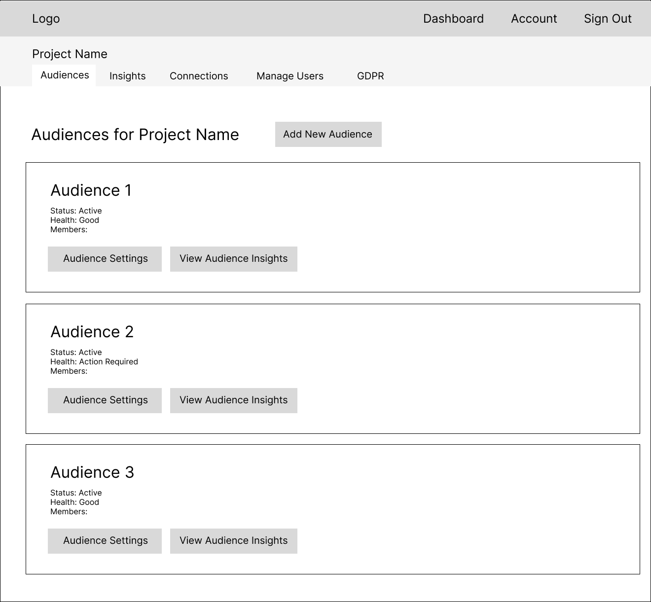
A Three-Part Solution in the IA

User lands now on a dashboard that shows all the projects they’re on instead of within a specific project
A new page added where audiences of a specific project are visible
All pages under the project page is split into a different flow (indicating a split menu)
Simplifying The Set-Up Process
A 4 step process takes place to set up an audience with the ability to pull in data from behaviours and transactions. It’s long because it has to be detailed.
As we received feedback that the audience set-up was hard to keep track of, a number of new UI components we introduced to help users keep track of their process. This also helps entry-level industry professionals become familiar with platform and marketing terminology.
In-page cards
Labelled cards help group interactive elements by task. This helps users identify areas of relevance with a quick glance of a page. Some are collapsible to give user control without taking up too much real estate, but their labels are always visible even when collapsed.
Steppers
To break down and sign post long form processes into bite-sized sections to make the process less overwhelming for users and helps them anticipate how long there is to go.
Icons / Tooltips
To help new users familiarise themselves with the terminology of the platform and be able to navigate with ease on a day to day basis.
Rethinking the audience management system
Feedback from the early stage project specific audience page indicated it was hard to navigate a specific audience when there are more than 3 or 4 in a project.
This also meant that issues like connection errors that need fixing could be missed at first glance.
New Features Added to Help with Navigating the Multiple Audiences
Search and filter options added to audiences
Ascending and descending options
Action required icon shows connection needs fixing
Colour and text indication for paused and action required audiences
More audiences at a glance with new layout
UI Pattern Library for Ease of Development
I expanded the UI pattern library from the original website. This has been provided to Thirty-One Circles on figma for future updates. This allows for an iterative design process while ensuring continuity and consistency of the look and feel of all components of the build.
Results and Feedback
The platform is currently in use by teams across multiple companies, with additional companies lined up to begin their subscription in the near future. Results from a retail company has shown in a head to head test across 2 months:
89%
better Return on Advertising Spend
-29%
Cost per Action